

Why Form Accessibility Matters
Forms are critical infrastructure for government services. Whether someone's applying for a permit, registering for a program, or submitting feedback, they need forms that work for them. That's not just nice to have — it's a legal requirement under WCAG 2.1 Level AA standards.
But here's the thing: accessible forms aren't harder to build. They're actually clearer and easier for everyone. When you add proper labels, clear error messages, and logical tab order, you're making forms better across the board. Keyboard users benefit. Screen reader users benefit. People on mobile benefit. People who are tired or distracted benefit.
The reality: About 1 in 4 adults in Canada live with some form of disability. That's not a small number. It's your actual user base.
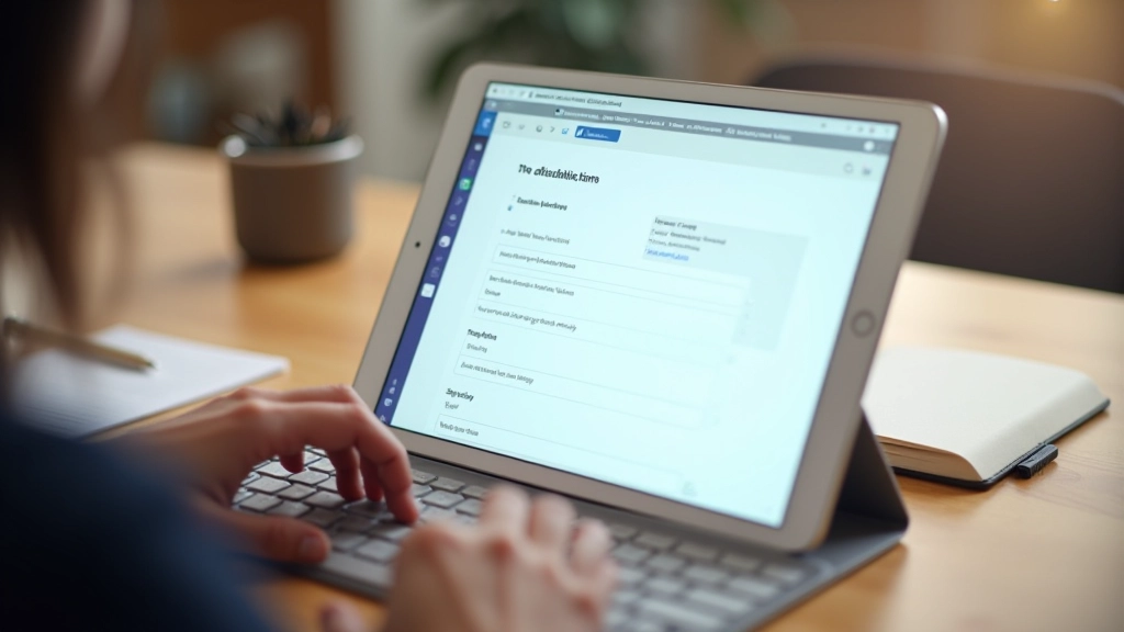

The Core Principles
Building accessible forms comes down to four key things. First, every form field needs a label. Not a placeholder — a real label. You'd be shocked how many forms use placeholders as labels, then they disappear when you start typing. The person's left staring at an empty field with no idea what goes there.
Second, logical tab order. If I'm using a keyboard, I need to move through your form in order that makes sense. Left to right. Top to bottom. No jumping around. Third, clear error messages. When something goes wrong, tell the user exactly what went wrong and how to fix it. Not "Invalid input." Tell them "Phone number must be 10 digits."
Fourth, proper color contrast. Don't rely on color alone to show required fields or errors. Use icons, text, or visual patterns alongside color. Someone who's colorblind needs to understand your form without relying on red or green.
Practical Implementation Steps
Use Proper HTML Markup
Use semantic HTML. That means
<label>
elements associated with inputs using the
for
attribute. Use
<fieldset>
and
<legend>
for grouping related fields. This isn't extra work — it's the right way to write HTML.
Test With Real Assistive Technology
Don't guess. Test your forms with a screen reader. NVDA is free. JAWS is the standard in government. Spend 30 minutes using your form with a screen reader and you'll spot problems immediately. Tab through it with just a keyboard. No mouse.
Make Error Handling Clear
When validation fails, show the error message next to the field that has the problem. Use
aria-describedby
to connect the error message to the input. Let the user know exactly what needs to change.
Ensure Sufficient Color Contrast
Text and labels need at least 4.5:1 contrast ratio against the background. Check this with a tool like WebAIM's contrast checker. It takes two minutes and saves you from invisible text problems.

Important Note
Individual learning outcomes and implementation results vary depending on your specific technical environment, existing systems, and team capabilities. These guidelines represent best practices for WCAG 2.1 Level AA compliance, but every organization's situation is unique. Test thoroughly with your actual users and assistive technologies before deploying forms to production.
Making Forms Work for Everyone
Here's what we know: accessible forms aren't a burden on your design or development process. They're actually simpler, clearer, and more usable for everyone. You're not adding complexity. You're removing it.
Start with one form. Test it with a keyboard. Test it with a screen reader. Get feedback from people with disabilities if you can. You'll be surprised how many quick wins you find. Once you build one accessible form, the next one's easier. And easier still after that. It becomes the normal way you work.
That's how Montreal's digital services get better. One form at a time. Built right from the start.